| |

Thermometer Chart in ExcelThe thermometer chart can be a good choice in conditions where you want to represent your data when given the actual and target values. By Default, Excel doesn't provide an option to directly insert the Thermometer Chart in your worksheets. The common scenarios where Thermometer charts are mainly used are in analyzing the sales performance of provinces or sales representatives or employee feedback ratings vs. the target value. Let's explore more about this chart type in this tutorial. What is Thermometer chart?"Thermometer chart in Excel is defined as a picturing of the actual data of well-defined measure, for instance, achieved sales target when compared to a given target. Thermometer chart is a linear version of Excel Gauge chart." The illustration of a Thermometer Chart is shown below: 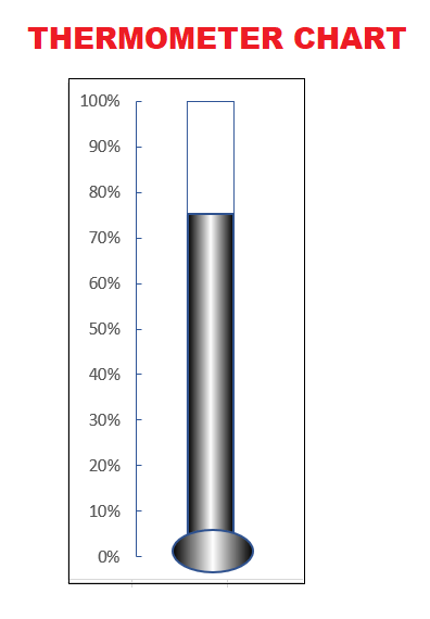
A Thermometer chart keeps track of a single task, for example, achievement of sales target, representing the completion of work when compared to the target. It shows the percentage of the job done, while taking target value as 100%. The Thermometer chart can be efficiently used in Microsoft Excel for the making of the followings things that are as follows:
AdvantagesThe advantages of using a Thermometer Chart in Excel are as follows:
Limitations of the Thermometer chart in the Microsoft ExcelThe various constraints that are related to the use of the Thermometer chart in Microsoft Excel are as follows:
Steps for creating a Thermometer Chart in ExcelBy default, Excel doesn't provide an option to insert the Thermometer Chart in your worksheets directly. So how to create a Thermometer chart? A thermometer chart in excel is created with the help of a Bar chart only. A little knowledge, and you need to play with the chart settings. That's it; your chart will be ready. For creating a thermometer chart, always make sure to prepare your data in Excel the using the below-given rules:
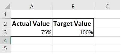
Creating a Thermometer Chart Follow the step-by-step explanation to create a Thermometer chart in Excel: Step 1: Select the actual and the target data. Step 2 - Go to Insert-> Charts-> Clustered Column chart. It will create the following chart for you. 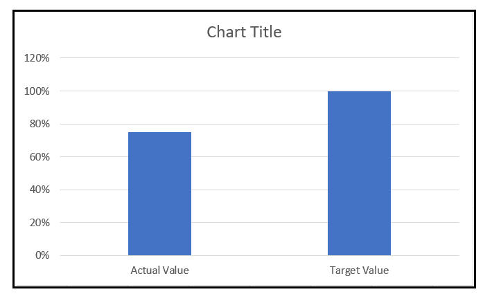
Step 3 ? Click once on your Column. Go to the Chart Design tab on the Excel ribbon.Click on the Switch Row/ Column option. 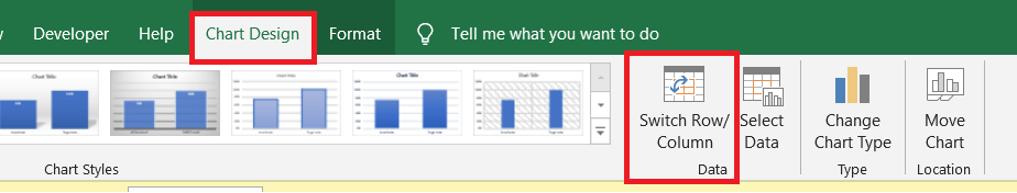
Step 4 - It will change the colors of your bars?Right-click on the Target Column (the one with orange color). The following window will appear. Select the Format Data Series option from the list. 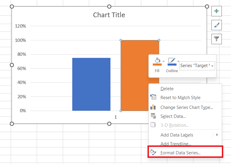
Step 5 - It will open the Format Data Series option from the right side of worksheet pane. From the series option click on the Secondary Axis. As you can see, selecting the secondary chart will merge both the columns whereas it will create two different ranges for Primary Axis and the Secondary Axis. 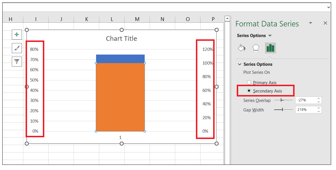
Step 6 - Next, we will right-click on the Primary Axis. The following window will open. Select the Format Axis option. 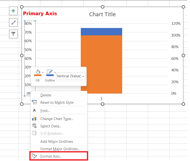
Step 7 - It will display the Format Pane options on the right side of your Excel worksheet. Set the following under AXIS OPTIONS in the Format Axis pane ?
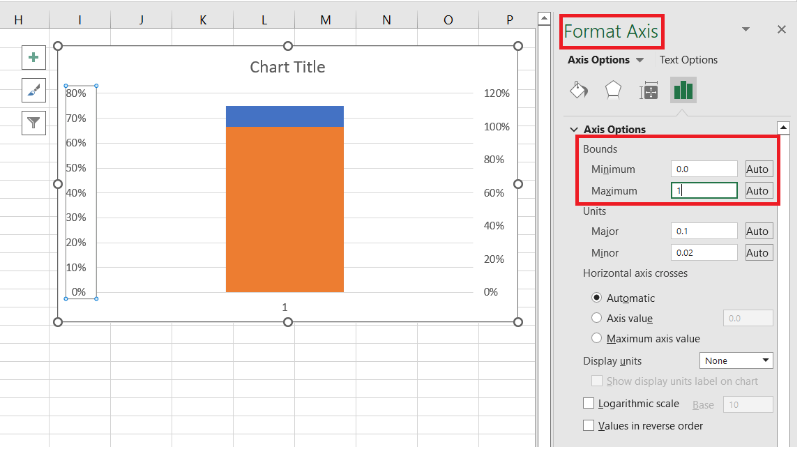
Step 8: Repeat the above step (step 7) again for secondary axis and change the max and min bound to 1 and 0 respectively. 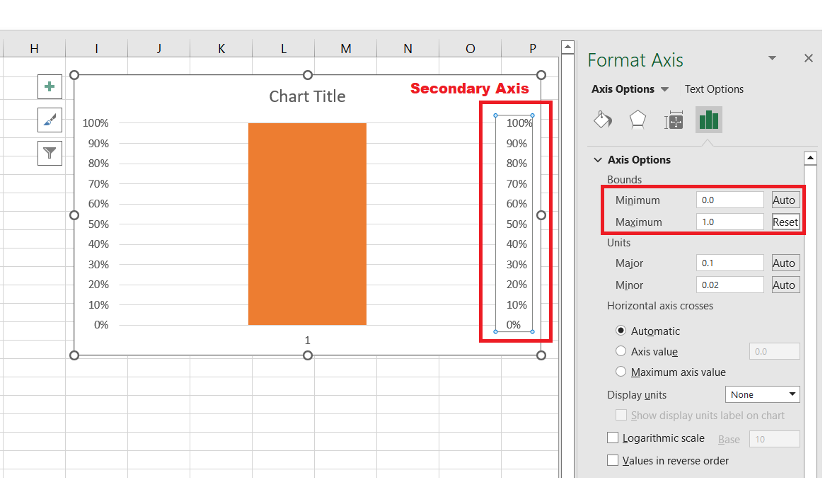
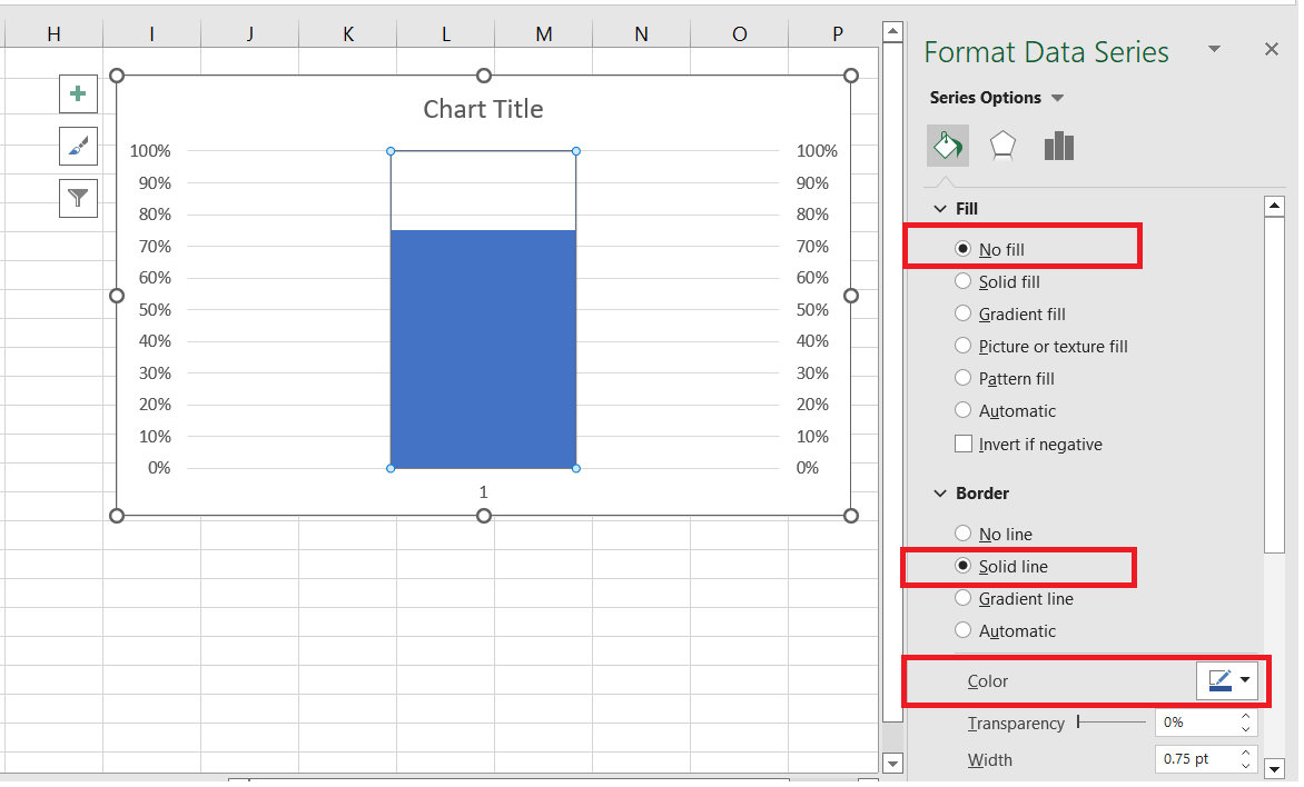
Both the axis values will be set to 0% - 100%. You will observe the above settings will hide the Actual Column. Step 9 - Again right-click on the Target Column. From the list select the Format Data Series option. 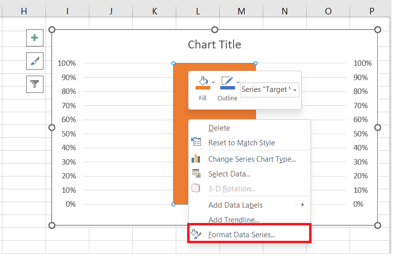
Step 10 - The following window will appear. Do the following ?
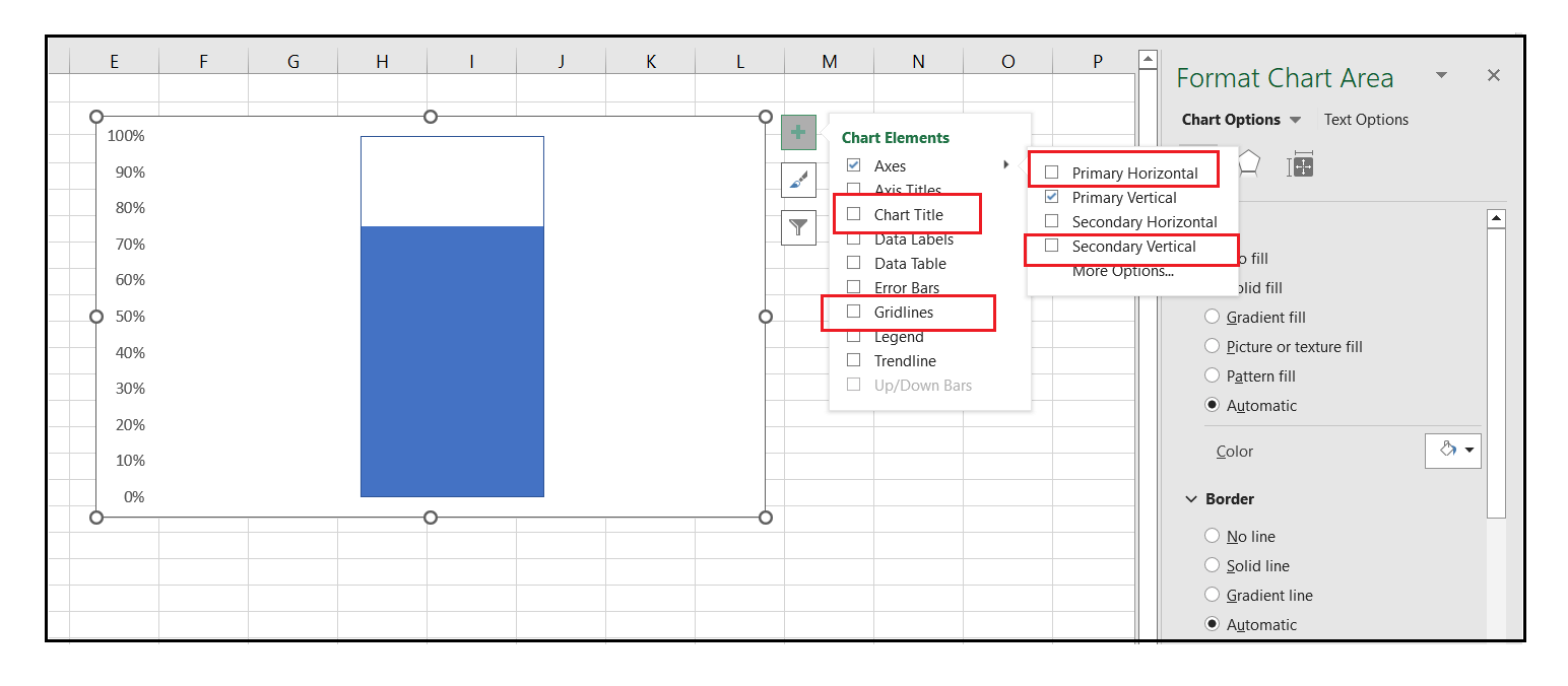
Step 11 - Click on the + icon present either on the left or right corner of your chart. It will open the Chart Elements window, do the following ?
Step 12 ? Right click on the Primary Vertical Axis. From the list, select the Format Axis option. 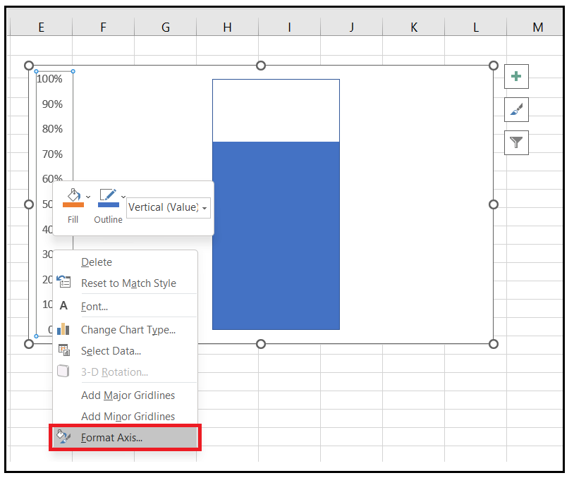
Step 13 - The Format Axis pane will appear. Go to the TICK MARKS option-> click on Major type -> select the Inside option. 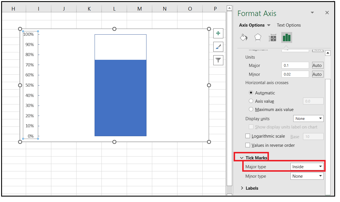
Step 14 ? Right click on the empty space of your chart (also known as Chart Area). From the list, select the Format Plot Area option. 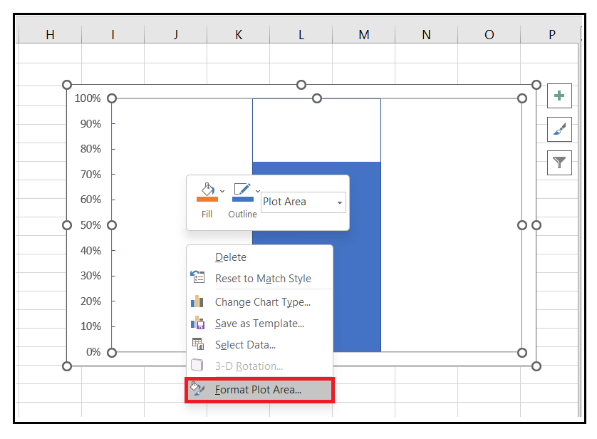
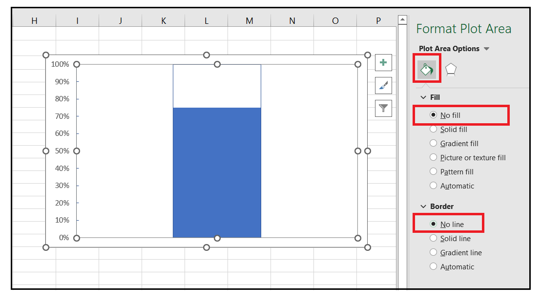
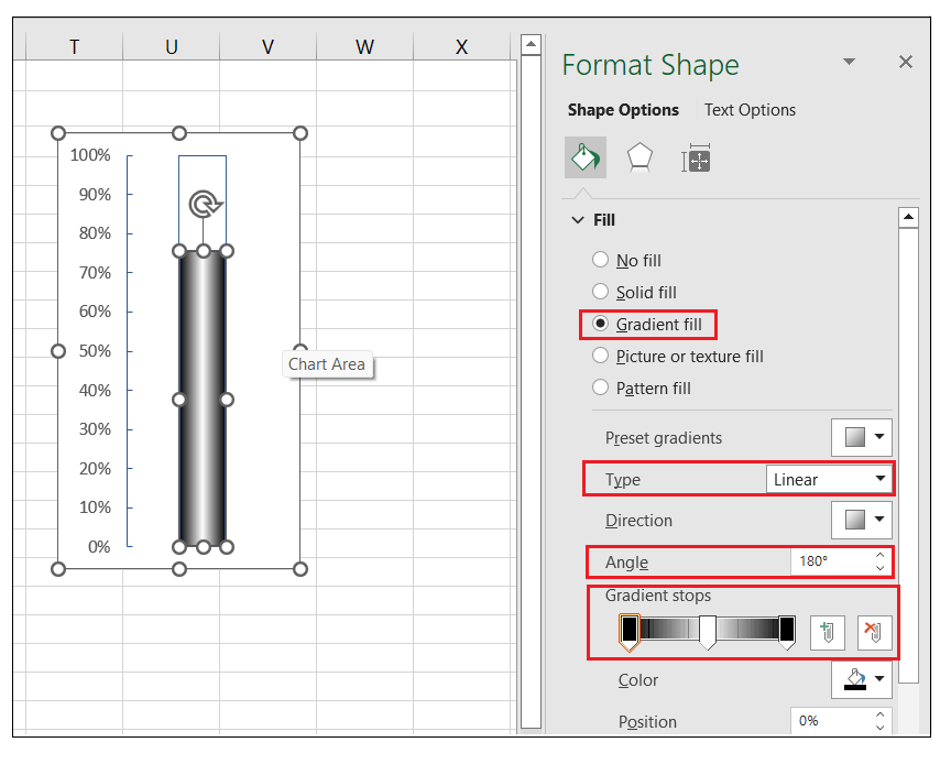
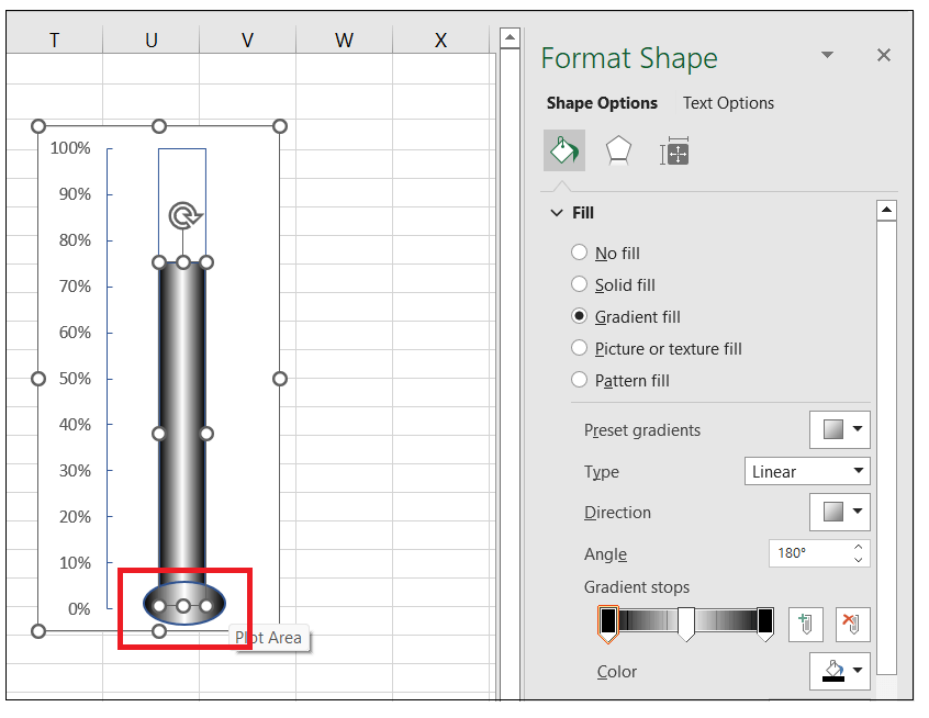
Step 20 - From the Format Plot Area Pane window, click on the 'Fill & Line' option. Do the following ?
Step 21 ? Resize the Chart window to create the desired thermometer shape for your chart. 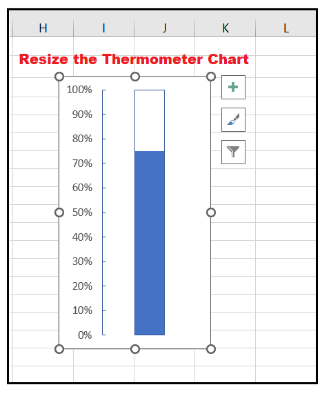
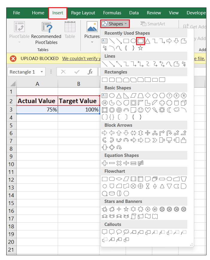
Step 22 - After resizing, we have to add an oval shape from the Design tab to make our chart look more like a Thermometer. You can even make the chart more appealing by applying chart formatting. Do the following:
Step 23- If you have correctly followed the above steps, your job is done! As a result, Excel will create a Thermometer Chart for you using the Target value and the Actual value (100%). 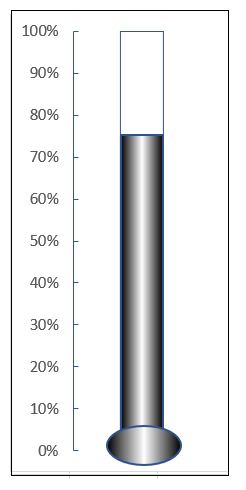
Note: The thermometer chart is useful keeps track of a single task. In case you have two or more tasks, you either need to create multiple thermometer charts for different data values, or you must opt for a different chart type (unlike the Bullet Chart or the Target Chart).
Next TopicPivot table in Excel 2011
|
 For Videos Join Our Youtube Channel: Join Now
Feedback
- Send your Feedback to [email protected]
Help Others, Please Share


