Histogram chart in Excel
Charts are a visual representation of your data. In Excel there are different types of charts that one can create on the basis on their conditions and requirements. One such type is Histogram chart. This chart is used to display the periodic rise and drop in the selected data using vertical columns.
This tutorial we will cover all the detailed information regarding Histogram chart.
What is Histogram Chart?
"A histogram is defined as a graphical depiction of the distribution of numerical data. They are incorporated in Excel worksheets to display the periodic rise and drop in the selected data using vertical columns."
A histogram is a column chart that represents the frequency of data in the specified range in an easier way. It offers the visualization of a numerical dataset by using the given data points within a given range of values.
The Excel Histogram Chart are classified into 5 parts:
- Title: This is the area of your chart that describes the detail about the histogram.
- X-axis: It represents the assembled interval that signifies the scale of values in which all the measurements fall.
- Y-axis: It represents the scale that represents the number of times the values occurred within the intervals set corresponds to the X-axis.
- The bars: This parameter is shown using height and width. The height of the chart bar tells the number of times that the values occurred within the interval. The width of the bars shows the interval or distance, or area that is covered.
- Legend: This gives the extra details about chart measurements.
Advantages of Histogram
The benefits of a Histogram chart are as follows:
- The histogram chart is used to display the visual image of the data distribution.
- Histogram chart shows a great amount of Excel data and the occurrence of data values.
- They are simple and easy to figure out the median and data distribution.
Where is the Histogram Chart located?
The histogram chart option is found under Analysis ToolPak. The Analysis ToolPak is a Microsoft Excel data analysis add-in. Many of you may not find in your Excel ribbon, don't worry many times this add-in is not automatically loaded on excel. Before moving to create histogram, let's cover the steps to load the Analysis ToolPak add-in in Excel worksheets.
Steps to Create Histogram Chart
Before creating Histogram charts in excel, make sure you have appropriate Bins adjacent to the chart data. Now the question arises what are Bins?
"Bins are numbers that signify the intervals in which the user wishes to group the data values. These breaks or intervals should be consecutive and non-overlapping and their size should be equal".
Create a Histogram in Excel if different with different Excel versions. Primarily there are two methods:
- If you have the latest Excel Version of 2016 or above, you can easily create a Histogram chart using the inbuilt histogram chart option.
- If you have Excel 2013, 2010 or earlier versions, you may not find the inbuilt option; instead, you must create the chart with the help of Data Analysis ToolPak.
Let's understand the step-by-step implementation of both the ways.
Creating a Histogram chart in Excel 2016:
As discussed with Excel 2016, you will find a built-in histogram chart option under the chart section. Follow the below steps:
- Select the dataset for which you want to create the Histogram chart.
- Go to the Excel ribbon tab and click on the INSERT menu.
- Click on the Insert Static Chart, present under the charts section.
- It will open a dialogue window. Click on the Histogram chart icon located under the HISTOGRAM section.
- As a result, it will create a histogram chart based on your selected data values.
- Though if you want to beautify it, you can style, format and enhance your chart. To do this, right-click on the created histogram chart on the vertical axis and select the Format Axis from the displayed options.
Some simple steps and your chart is ready! But that's not the case if you are working with Excel version 2013, 2010, or earlier. To work on those versions, you must enable the Data Analysis ToolPak to create a histogram.
Creating a Histogram chart in Excel 2013 or earlier versions:
Before creating a chart in Excel, we must download and activate the Data Analysis ToolPak in your Excel workbook. You an even implement the same steps in Excel 2016 version to load the Toolpak add-in.
Following are the steps to do so:
How to enable the Analysis ToolPak add-in in Excel
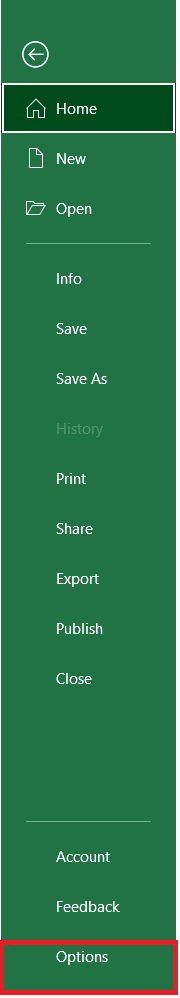
- Go to the file tab. From the displayed values, click on the Options button.
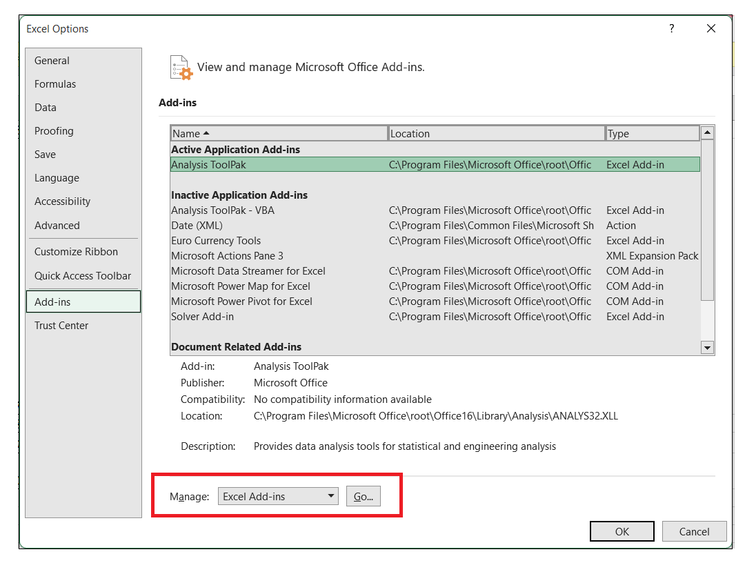
- It will open the Options Dialog window. From the left side of the window, bar click on the Add-Ins button.
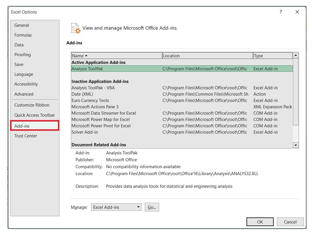
- It will again open the Add-Ins window. Refer to the below image. From the resulting window, select the Add-ins option located under the Manage field. Click on the Go button present on the right side.
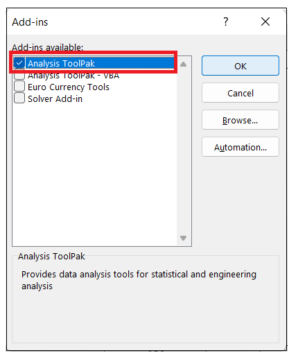
- It will open the following Add-Ins window. From the drop-down options, choose the Analysis ToolPak and click on the OK button.
- Once you have completed the above steps, you will notice the Analysis ToolPak is loaded in excel now. It will be found under the DATA tab with the name Data Analysis.

Note: Sometimes while working on adding the ToolPak, you may receive an error stating that the Analysis ToolPak is not currently installed on your system. In such situations, click on the Yes option to install it.
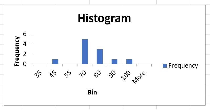
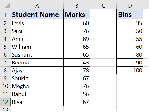
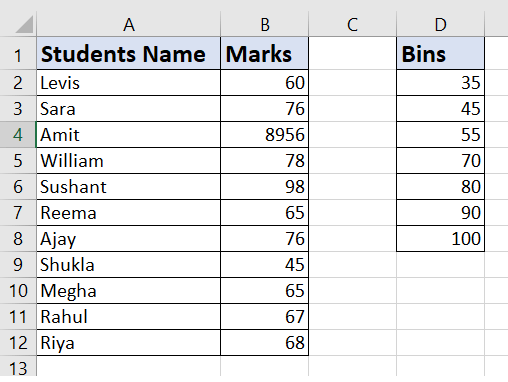
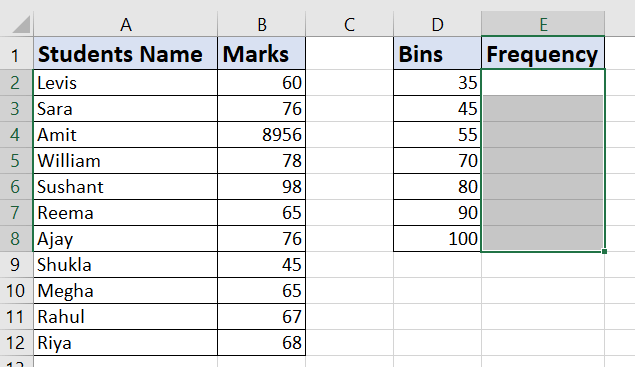
Example 1: Create a histogram chart for dataset of marks scored in Exam (out of 100) of 12 students
We are given the following data.
Since before creating the histogram chart, firstly we need to create intervals (also known as bins) for which we want the find the histogram frequency.
As shown below, create the bins and place them adjacent to your dataset.
Following are the steps to create a Histogram chart in Excel:
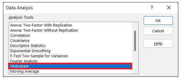
Step 1: Select the histogram chart from Data Analysis tab
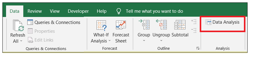
- Go to the data tab. Under the analysis section, click on the Data analysis option.
- It will open the following data analysis window. Select the Histogram chart and click on the OK button.
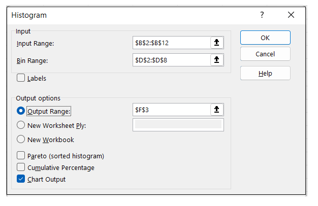
Step 2: Fill proper details in the histogram window
- A histogram window will appear. Enter the below given details:
- Specify the input range of your chart. In our case we will select the scores of Column B
- Specify the Bin Range. In our case we will select the Intervals column D)
- If you have included heading in your selected data, make sure to select the label option. If your selected data doesn't include headers, you can leave it unchecked.
- Next, go to output range. In this field we will whether we want to create the histogram within the same worksheet or on a new worksheet. Either specify the cell address or click on the New Worksheet option (if you want to place it on a new worksheet).
- At last Choose the Chart Output Option and click on the OK button.
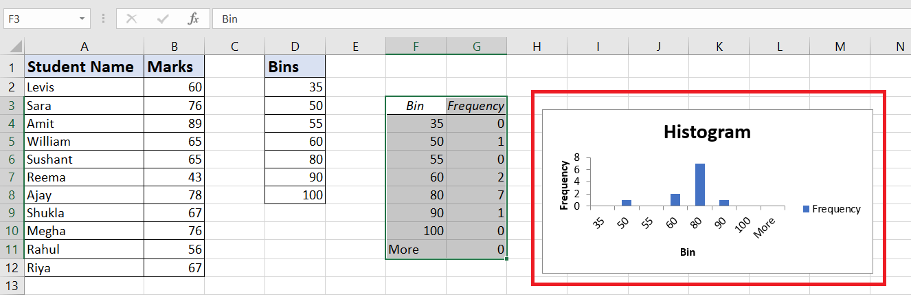
Step 3: Excel will create the histogram for you.
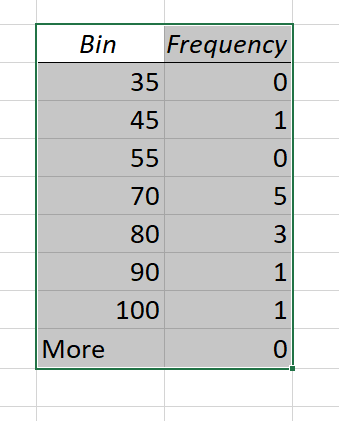
You will notice that the Histogram chart and a Frequency Distribution table is successfully create in the specified cell address of your Excel worksheet.
Explanation:
- The First interval of our bin starts from 35. To conclude, the histogram chart computes the frequency of all the marks below 35 includes all the values below it. For bin value 35, frequency 0 indicates that there are 0 values below 35.
- The last bin ends at 100. If any value exceeds the previous bin, Excel automatically creates another bin named- More. This bin contains all the data values greater than the last bin.
- In our case, we are given a static histogram chart. Static implies that even if you make any minor change to your primary data, it won't get changed in your chart; you have to create the histogram chart from scratch again.
- In case you want to enhance your chart, you can also do the formatting of this and insert different elements, unlike other charts.
Creating a Histogram in Excel using FREQUENCY Function
So far, in the above example, we have created a static histogram chart. But what if we want to create a dynamic histogram? Dynamic means it will automatically restore the update whenever you change your data set.
To make it dynamically possible, we will take advantage of the FREQUENCY function to create a dynamic histogram. We will take the same data (as used in the above example).
Following are the steps:
- The first step is to create the data intervals (bins) wherein we will display the frequency numbers.
- Select the cells adjacent to your bins data. Here in our case, we have selected E2:E8.
- Press the F2 key on your keyboard to enable the edit mode.
- Next we will incorporate the function that will automatically calculate the frequency for each interval for the data in your Excel sheet.
=FREQUENCY(B2:B12,D2:D8)
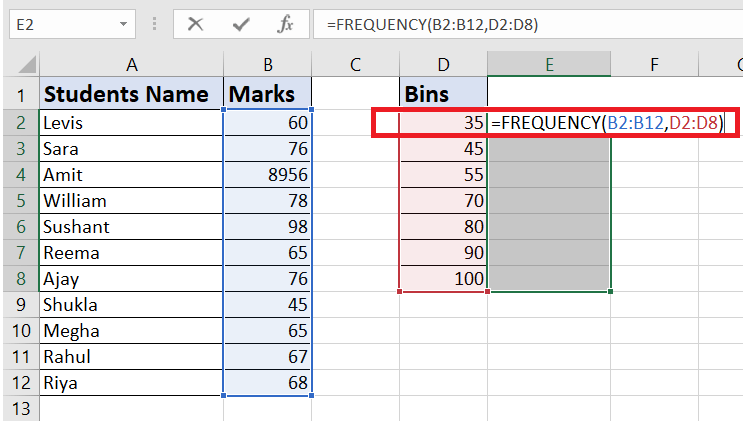
- Hit the Control + Shift + Enter button.
NOTE: Because we have incorporated an array formula, therefore we will press the Control + Shift + Enter keys, instead of just the Enter button.
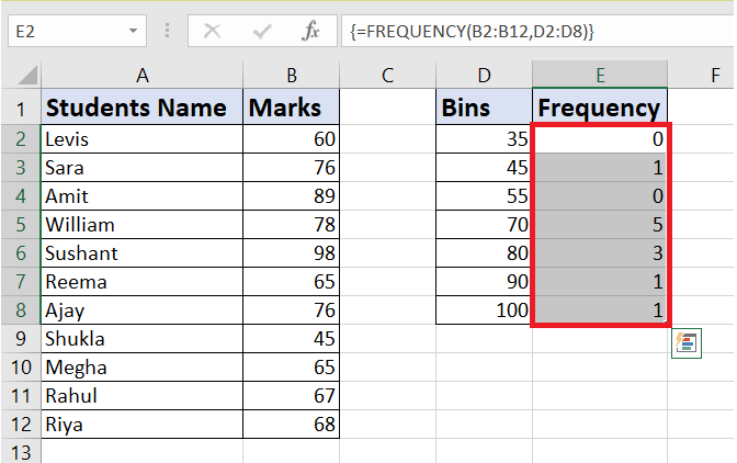
- You will get the frequencies. Using the frequency output, you can easily create a histogram. Go to chart-> select a simple column chart.
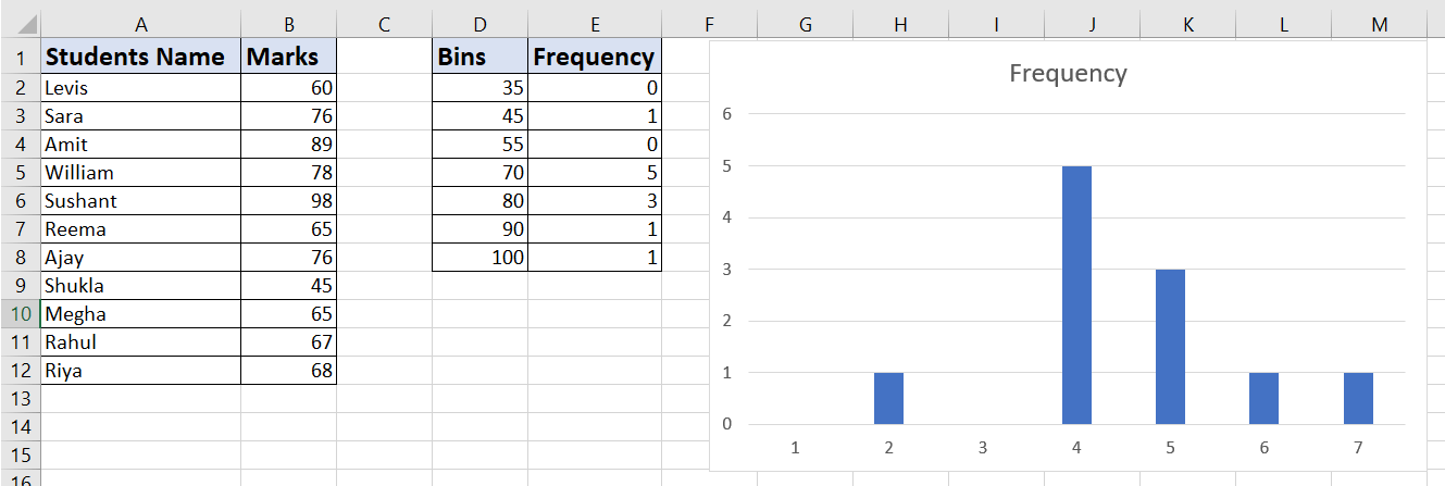
You will have the following dynamic histogram chart.
Things to Remember
- The histogram chart is popular because it uses contiguous data where the bin figures out the data range.
- The Histogram chart bins are determined as consecutive and non-overlapping intervals.
- It is easy to work with Histogram charts because the bins are of equal
- size and placed on adjacent sides.
- If you are a Microsoft user carrying an Excel version 2013, 2010 or earlier, you may not find the Analysis ToolPak under the Data tab. To enable it, you need to activate the Excel add-Ins.
|

 For Videos Join Our Youtube Channel: Join Now


