What is Radar Chart in Microsoft ExcelIt was well known that the respective Radar Chart in Microsoft Excel is usually a graph that is having several axes (lines) and is starting from a single point in the middle. Each line usually depicts a data from a separate data column, connecting the data points in a circular format as well. The other name for the Radar chart is none other than the: Web, Spider, etc Besides all this, they are very useful for performing the comparison of the multiple variables and their values in a given single chart respectively, hence making it easier to identify out the various patterns as well as the various variations associated with the data points. Radar Chart in Microsoft ExcelA Radar Chart is basically a special type of Chart that can be effectively used to visualize multivariate data as wells, and the radar chart basically consists of a series of spokes that radiate out from the central point, in this each spokes represents a different variable, and the selected data is effectively plotted on each spoke by using of the line or area, and the outcome will be generalized as web, star, or spider-like patterns in an effective manner. List out the types of Radar charts available in Microsoft ExcelIn Microsoft Excel, the "Radar charts" primarily exist in three variations that are none other than the following ones
Each type of chart has advantages that can be useful for the various purposes, so now let us discuss each type of the Radar chart in detail. Standard Radar Chart: In Microsoft Excel, the standard radar chart is termed to be one of the most basic types of the radar chart, in which the data points are usually plotted as vertices on the given Chart and are effectively connected by a line. They are very useful for simultaneously comparing out the multiple variables as well as identifying the patterns in the given data respectively. Filled Radar Chart: In the Filled Radar Chart, the area enclosed by the respective data points and it is filled with colors as well, and hence providing a clear visual representation of the data, we can also make use of it to depict the relative importance of the different variables and how they will be contributing to an overall score respectively. Polar Area Chart: The Polar Chart in Microsoft Excel is very similar to the filled radar chart, as in this type of the Chart the selected data points are plotted on a circular grid instead depicting by polygon. And the area which is enclosed by the data points is primarily divided into various segments and each segment represent a different variable. This could be used to depict how different variables contribute to an overall score and also to compare multiple data sets at once. How read a Radar Chart in Microsoft ExcelSuppose that, we are required to compare the top 5 products of our electronics company sells. So for this, we will be making use of the sales data from the second quarter of 2023 to create a radar chart in Microsoft Excel, where:
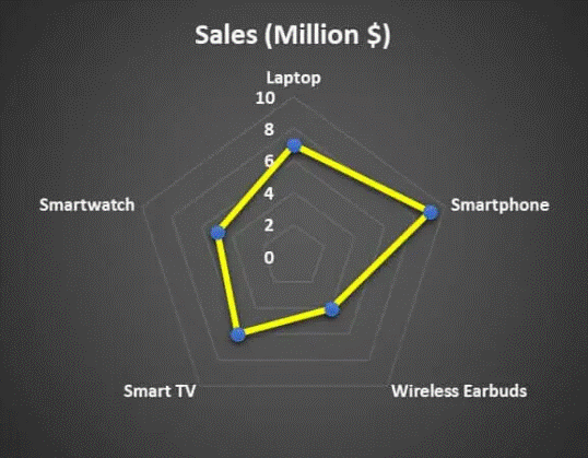
#1: Interpretation of the Radar Chart with a Single Data Point Since we have only one data point for the sales, so in that case we can easily read the radar chart in Microsoft Excel by using below-mentioned point effectively:
Our best-selling product can be easily depicted by the data point which is farthest from the center. And in this case, the smartphone is our highest-selling product. #2: Interpretation of the Radar Chart with Multiple Data Points As we have seen that in our previous example we had one single data point (sales), but we can also make use of it to study multiple data points as well. To understand this clearly, let us now suppose that we are choosing a top-rated tourist spot for a particular trip, and then we can easily create a spider chart where each axis represents a specific tourist place, and the points on the lines depicts out the ratings for the Sightseeing, Food, History, and Transportation at each place. 
And instead of this, we can easily interpret each data point individually, which are as follows:
One can easily compare all the metrics to know which tourist spot has the highest rating while considering out all the aspects, so as from the interpretation it could be concluded that the best place to visit will be Paris, which has the highest rating in terms of all the aspect in comparison to other 4. What are the key elements associated with the Radar ChartsWe must know what the tool comprises of before creating or using the radar chart in Microsoft Excel, and it will help us to identify out the data variations to include, when to use it, and how to use it. The various elements that are efficiently used in the creation of the Radar Chart in Microsoft Excel are as follows:
How to Read a Radar chart in Microsoft Excel1. Identify the Category that Each Axis Represents The first key step is to determine the data category on each axis of the Radar Chart in Microsoft Excel.
2. Determining How Categories Relate Once we determine each axis's category, we will be then evaluating the relationships that exist between the composite variables. And for each variable, we are required to make use of a homogenous scale to improve the reliability as well as the accuracy of the particular insights. 3. Checking out the Resulting Shape In this particular step, we must need to evaluate the overall shapes, which are effectively created by just connecting each data point on our Radar Chart in Microsoft Excel, and in this be can easily pinpoint the hidden relationships between the data points under study. 4. Compare Key Variables Now, the respective "Spider Chart" in Microsoft Excel is best suited to compare to the key variables in our respective data, and it makes use of the various shapes and contrasting colors to bring out the distinction insights in an effective manner How are Radar Charts efficiently used in various Businesses
What are the benefits of using a Radar Chart in Microsoft ExcelThe various benefits of making use of the Radar Chart in Microsoft Excel are as follows:
How can one easily understand the Radar Chart in Microsoft ExcelLike in the column chart in the spider chart in Microsoft Excel, we also have the X-axis and the Y-axis. The X-axis is each end of the spider, and every step is efficiently considered the Y-axis.

What are the key points associated with the Radar Chart in Microsoft Excel
How to Create a Radar Chart in Microsoft ExcelIt is well known that the radar chart in Microsoft Excel is very simple and quite easy to use, so let us now understand the workings of some radar charts with the help of examples. # Example 1: Sales Analysis in 4 different quarters by making use of the Radar Chart.Now, to achieve the above task effectively, we will be following the below-mentioned steps very carefully: Step 1: First of all, we are required to create data in the below format, which depicts the quarterly sales performance from the past 10 years. So after that, let us now represent this in a spider or Radar chart. 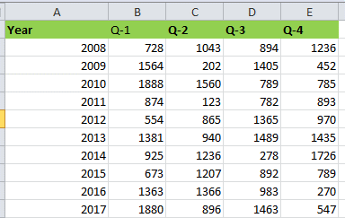
Step 2: Now, in this step, we must need to move to the "Insert" tab available in the Microsoft Excel sheet. Then, in the "Other Charts," we must select the "Radar with Markers" Chart. Doing this will also insert a blank radar chart in the Excel sheet 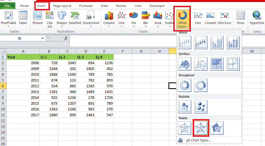
Step 3: After that, we will right-click on the Chart and select "Select Data," as depicted below in the figure 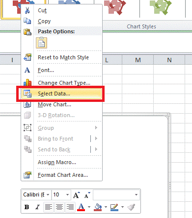
Step 4: And in this step we will be clicking on the "Add" option respectively. 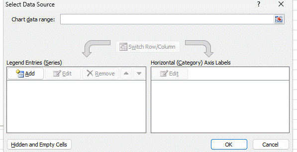
Step 5: Then we will select the "Series name" as "Q-1" and "Series values" as values, and after selecting this, we are required to click on the "OK" button. 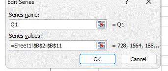
Step 6: We will repeat this procedure for all the respective quarters. And just after that, our screen should look like this. 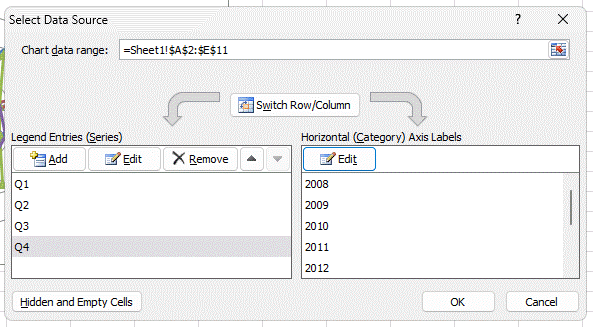
Step 7: After performing the entire step as mentioned above, we will be then clicking on the "OK" button, and by doing this, we will be inserting the Radar Chart in our Excel sheet in an effective manner. Below is the illustration of how the radar chart in Excel looks before formatting 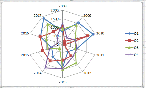
Step 8: In this step, we must format the Chart as per requirement and wish.To achieve this, we will right-click on each line and change the line color and the marker style option as per our needs. Next, we need to add chart titles to tell the user what it is. And finally, our Chart will look like this. 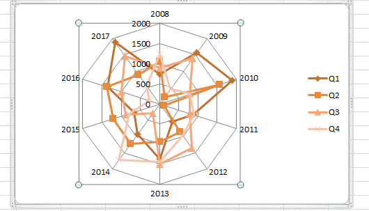
Interpretation of the above used data:Looking at the Radar outset, we can see that in 2012, Q1 revenue was the highest among all the 10 years of revenue, while in 2011, Q1 revenue was the lowest. And in Q2, the highest revenue was in the year 2011, and the lowest point was in the year 2014. Similarly, in Q3, the highest revenue was in 2009, and the lowest was in 2010. In Q4, the highest revenue was in 2011, while the lowest revenue was in the year 2012. And in none of the years, there has been a consistent growth of revenue over 4 quarters. There is always volatility in revenue generation across quarters as well. #2 Examples: Target with the Customer Satisfaction Level Step 1: In this step we are required to create the data in the below format after that we need to apply chart type 1. 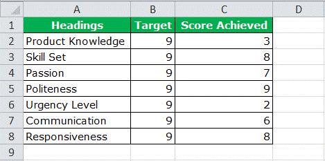
Step 2: Now in this particular step, we will be then selecting out the data to apply chart type 1. Insert > Other Charts > Select Radar Chart respectively. 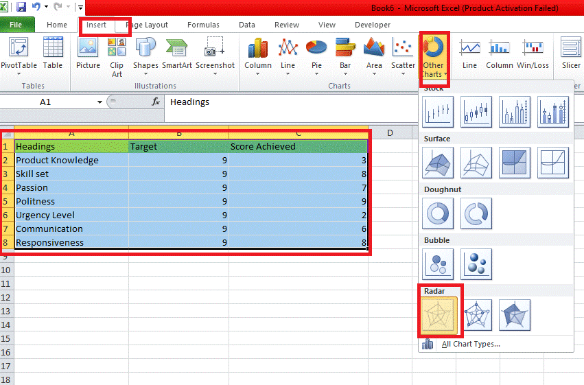
Initially, our Chart will looks like the one mentioned below. 
Step 3: In this step, we will be formatting as per our ideas. Change the target line color to red and the achieved line color to green, respectively.
After all the formatting, our Chart should look like the one below 
Step 4: Remove the legends and use manual legends to adjust the Chart neatly. To insert manually, go to the "Insert" tab and "Insert Shapes." Before removing and inserting manual legends 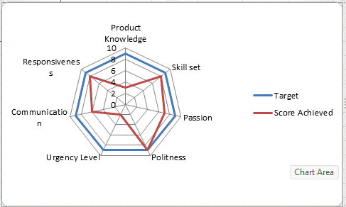
After removing and inserting manual legends. 
Interpretation of the Radar Chart in Microsoft Excel
List out the various Advantages of using Radar chart in Microsoft ExcelThe various advantages of making use of the Radar Chart in Microsoft Excel are as follows:
List out the various Disadvantages of using Radar chart in Microsoft ExcelThe various disadvantages associated with the use of Radar chart in Microsoft Excel are as follows:
Things to remember:
Next TopicDiameter Symbol in Microsoft Excel
|
 For Videos Join Our Youtube Channel: Join Now
Feedback
- Send your Feedback to [email protected]
Help Others, Please Share


