| |

Error Bars in ExcelMS Excel or Microsoft Excel is powerful spreadsheet software and enables users to record data as well as present it graphically. It includes various built-in options that help present the data graphically in different ways. The chart is one such option using which we can display our data in a graphical view, which increases the readability of the data. There is a wide range of existing charts in Excel to display different sets of data in different styles or views. When using charts, Excel allows us to associate error bars with certain types of charts, such as line charts, bar charts, and scatter charts. We can present a more comprehensive view of the desired data set with error bars, allowing users to see margins or errors in the data. 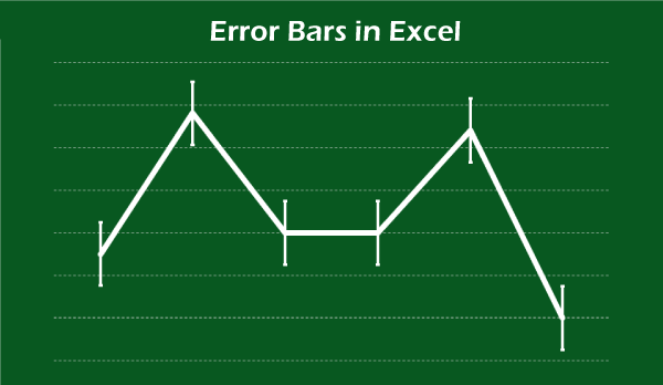
This tutorial discusses the detailed description of Error Bars in Excel, including different types or use-cases. The tutorial also discusses relevant examples to help us better understand each type of Excel error bars. What are Error Bars in Excel?In Excel, Error Bars refer to built-in tools that help represent data variability and measurement accuracy with graphics. These error bars mainly help display how far the actual values are from the reported values. We can insert these errors bars in the two-dimensional bar, line, column, area, bubble charts and XY (scatter) plots. Among these graphical representations, the error bars can be displayed both vertically and horizontally in the bubble charts and scatter plots. Moreover, the error bars can display plus, minus, or both directions with Cap and without Cap style of bars. Using error bars, we can represent a more comprehensive view of the desired data sets, allowing others to easily read or understand the margins or errors in the data. 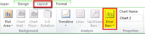
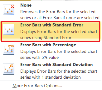
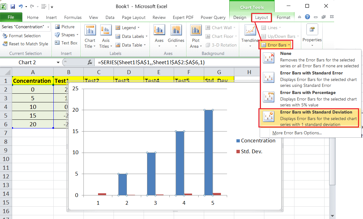
There are typically three types of error bars in Excel: Error Bars with Standard Error This type of error bar helps to represent the standard error of the mean for all values. The standard error makes it easy to demonstrate how far the sample mean is likely to exist from the population. Error Bars with Percentage This error bar type helps to represent error bars of 5% value to our existing graph. The error bars of 5% is added by default. However, we can change the percentage value as per our choice. We can manually change the percentage by going to the 'More Options' section. Error Bars with Standard Deviation This type of error bar helps represent the amount of variability of the data, meaning how much the data deviates as a whole. The bars are graphed with one standard deviation for all data points in Excel. We can use Excel's STDEV command to find the standard deviation in excel. Apart from the above options, we also get 'More Options' that helps us access preferences for accordingly specifying the desired error bar values and creating custom error bars. In the following image, we can see all the above-discussed types of error bars: 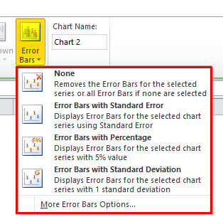
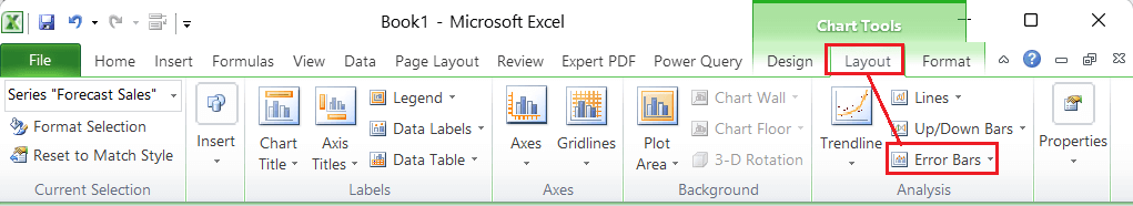
How to add Error Bars in Excel?Adding error bars in Excel is simple and easy. As discussed above, the error bars are available for certain charts, including the line chart, bar chart, and scatter chart or plot. However, the steps for adding error bars in corresponding charts are somewhat similar. They are as follows:
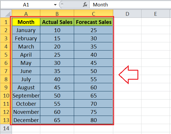
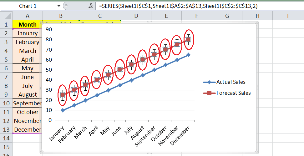
Let us understand each type of error bars with the help of examples: Example 1: Error Bars with Standard ErrorThe standard error refers to a statistical term used to measure the accuracy of a given data set. Standard error bars usually represent the exact standard deviation. In the context of statistics, a sample mean is a deviation from the true mean of the population, and that is why this deviation is usually called the standard error. For example, consider the following excel sheet with some random month-wise sales data. The sheet displays actual and forecast sales data, and we need to add error bars with the relevant chart. 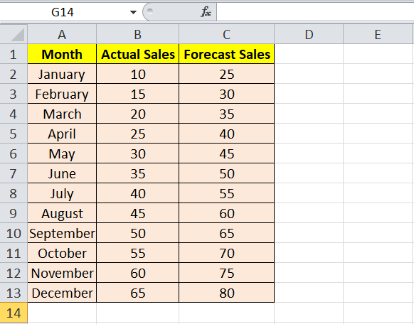
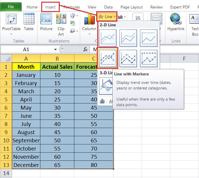
We must follow the below steps to insert excel error bars for our example data set:
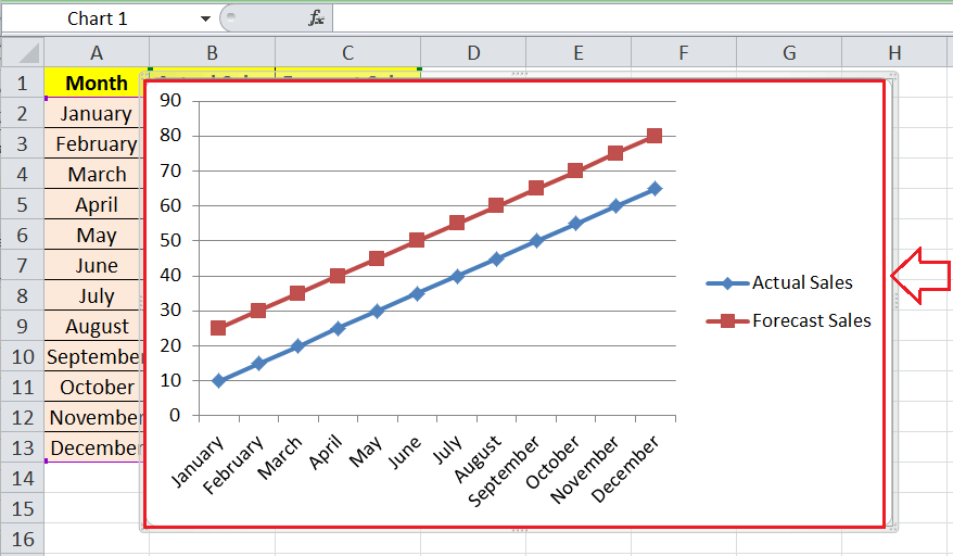
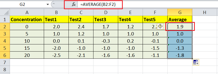
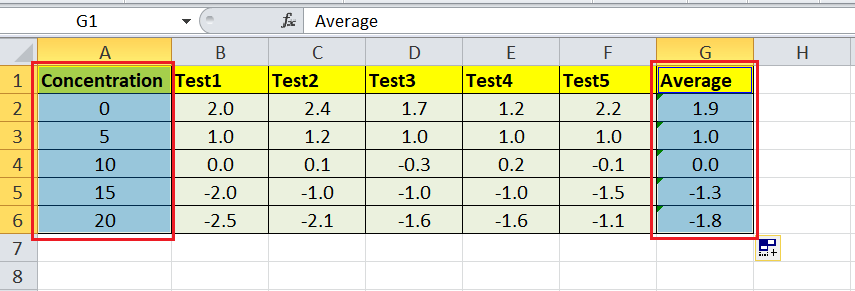
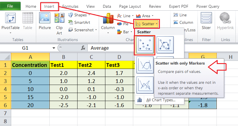
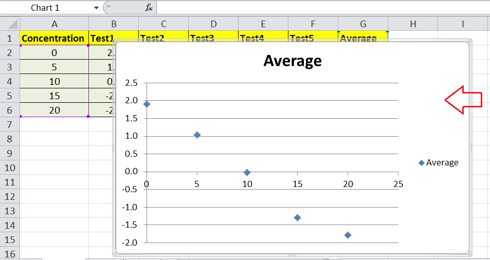
The chart above represents a statistical fluctuation measure of the actual and forecast sales data. Similarly, we can add or insert the error bars in other supported charts. After the error bars are added to the plotted chart, we can later adjust the formatting accordingly. Example 2: Error Bars with PercentageWe learned to add the error bars with standard errors in the above example. Now, let us understand another type of error bars. This example discusses the steps to add error bars with a percentage in the graphical chart. For example, consider the following excel sheet where we have some random test data. We need to draw a graphical chart for the data by calculating the average and adding error bars with the relevant chart. 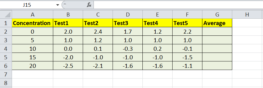
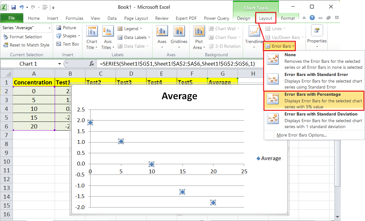
We must follow the below steps to insert excel error bars for our example data set:
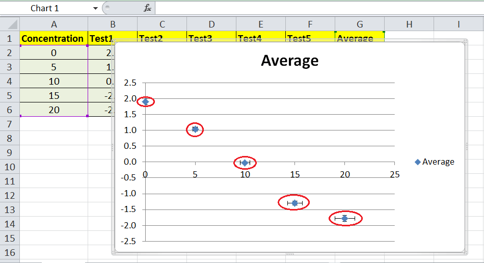
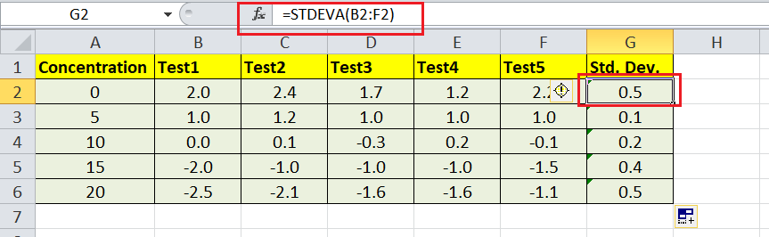
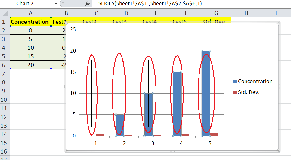
The above image shows the changes representing the Error Bars with percentage measurements. The bars reflect the error amount by the five percentages. It is the default percentage amount in Excel. However, we can change the Error Bars percentage amount as desired by adjusting the formatting via the 'More Error Bars Options'. Example 3: Error Bars with Standard DeviationIn this example, we discuss and add another essential type of error bars. Let us consider the same example where we have some random test data. 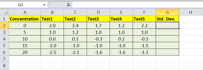
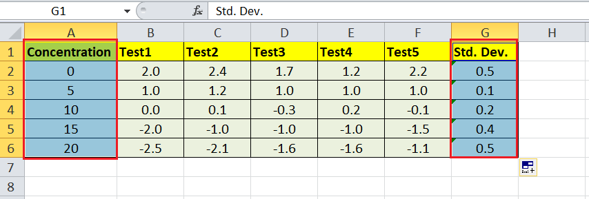
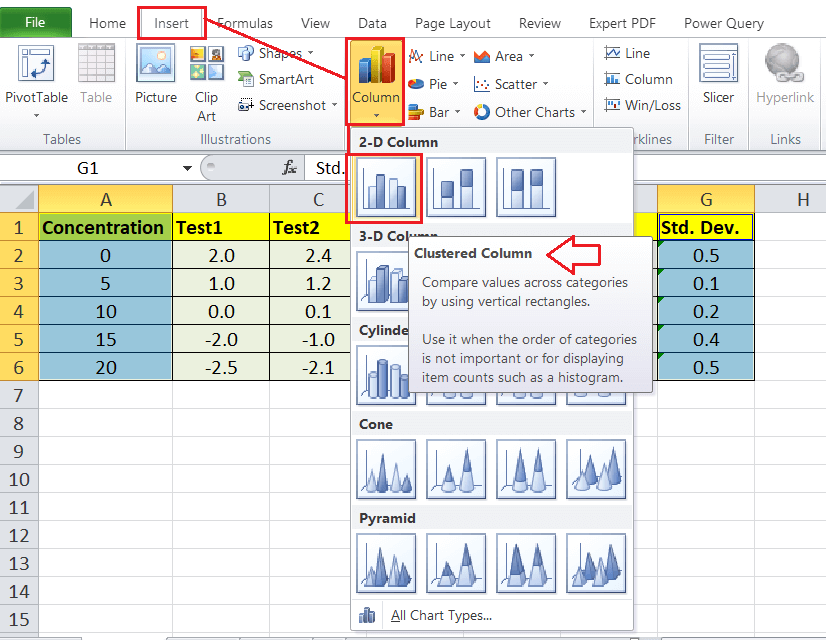
Since we will add Error Bars with Standard Deviation for the above data, we must first calculate the Standard Deviation. After that, we need to draw a graphical chart for the data based on the calculated standard deviation and add error bars with the relevant chart. We must follow the below steps to insert excel error bars for our example data set:
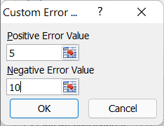
The above image shows the changes representing the Error Bars for the standard deviation measurements. In our example, the error bars displays a standard deviation of 0.5, 0.1, 0.2, 0.4 and 1.0. We can change the colours of these added error bars by adjusting the formatting, which will help us to highlight them. Creating Custom Error Bars in ExcelApart from Excel's existing error bars, such as the error bars with standard error, error bars with percentage and error bars with standard deviation, we can also use the custom error bars. Although error bars with standard error fulfil our needs in most cases, we can try creating custom error bars to display specific data series. We can perform the following steps to add the custom error bars in our Excel sheet:
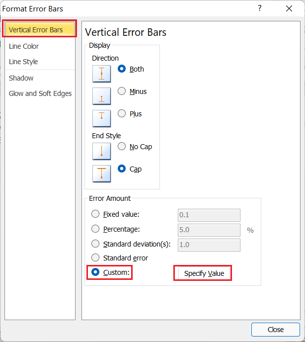
If we do not need to display positive or negative custom error bars, we must enter the values as zero in the respective box under the 'Custom Error Bars' window. We must ensure that none of the boxes is blank or empty; otherwise, Excel automatically retains the last used values, thinking we forgot to specify the value. Formatting Error Bars in ExcelExcel allows us to add/ insert the error bars and modify the formatting as per our choice. We can access the Format Error Bars window by going to Layout > Error Bars > More Error Bars Options. However, we must first select the object/element from the plotted chart to get the Layout tab on the ribbon. 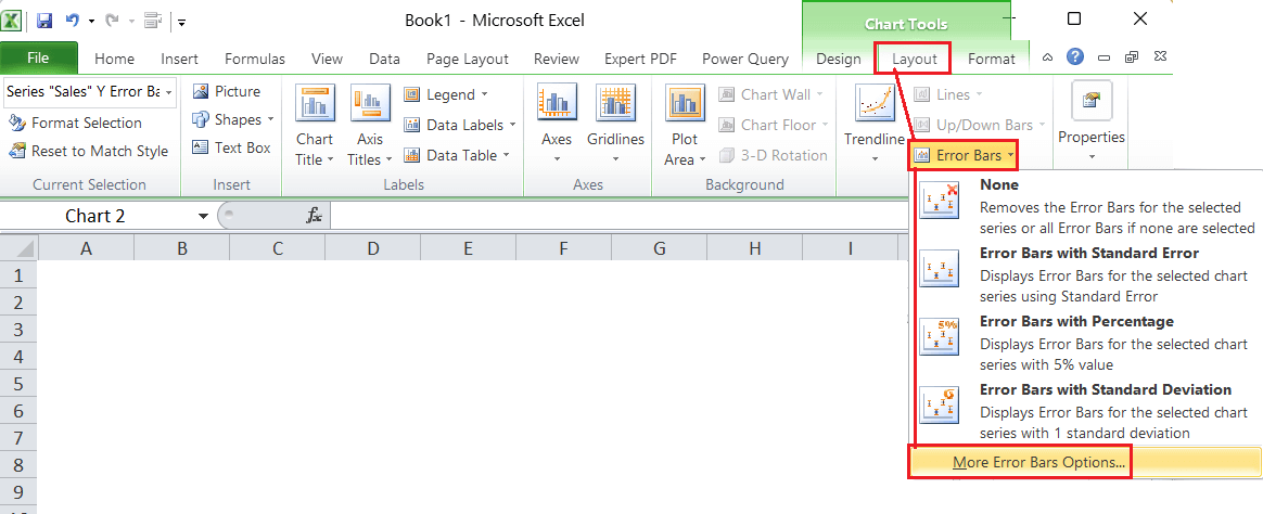
In addition to this, we can also press the right-click on any added Error Bars in the chart area and select the 'Format Error Bars' option from the list. 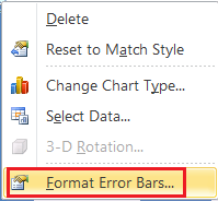
Another option to access the Format Error Bars window is to double-click on any existing error bars from the chart area. 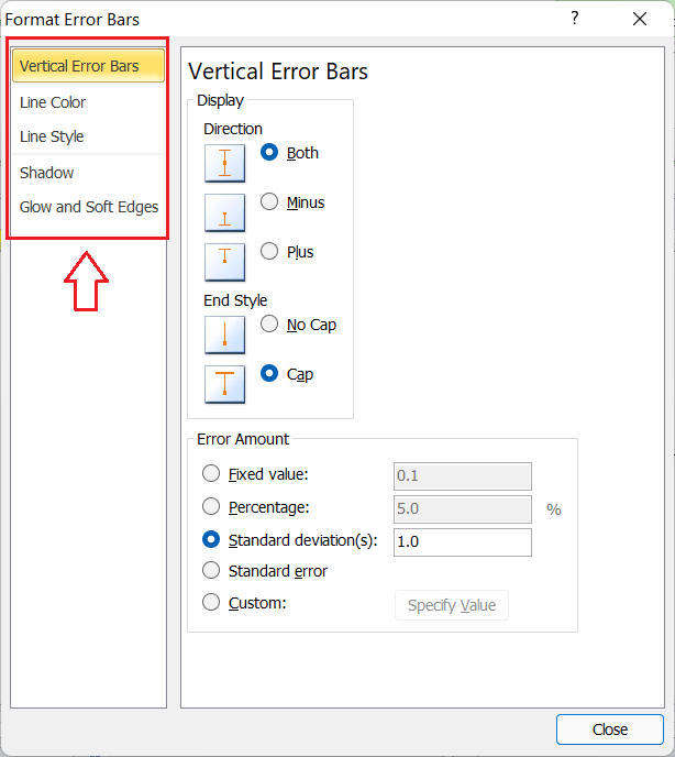
Once the 'Format Error Bars' window is displayed, we can go through the different categories and adjust the preferences accordingly. The window allows us to modify preferences for the error bars, such as the type, direction, style, colour, transparency, width, Cap, arrow type, percentage amount, etc. Deleting Error Bars in ExcelWhen we need to delete the error bars from our worksheet, we don't need to use any tool or option from Excel. It is easy to delete the error bars using the mouse and keyboard. It is just two steps process, as listed below:
The above steps delete all the error bars for the selected data series. If we have both the vertical and horizontal error bars in the sheet, we must delete them separately. However, the process to delete the error bars is the same. Note: We can also delete the existing error bars by selecting them and going to Layout > Error Bars > None. This also helps remove or delete the Error Bars for the selected series of data or all the existing Error Bars if none are selected.Important Point to Remember
Next TopicValue Error in Excel
|

 For Videos Join Our Youtube Channel: Join Now
Feedback
- Send your Feedback to [email protected]
Help Others, Please Share


