| |

Excel TrendlineCreating a graph or chart using your existing data in Excel is easy. But sometimes, you want to visualize the general trends in your data. This operation can be easily performed by adding a trendline to your graph. It may sound new or complex, but inserting a trend line is very easy with newer Excel versions. All you need to know is some little tricks to make your work easy. In this tutorial, we will discuss the various steps to quickly add a trendline in Excel, show its equation, fetch the slope of a trendline, and many more. Before starting with its implementation let's understand what does a trendline means: What is a Trendline?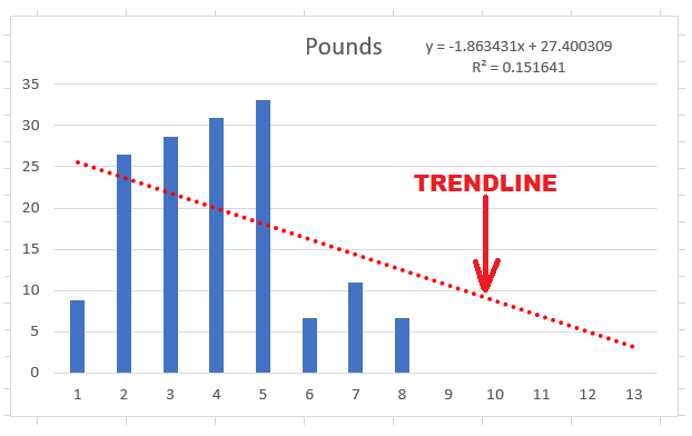
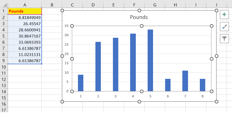
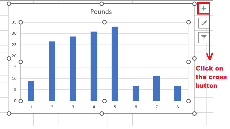
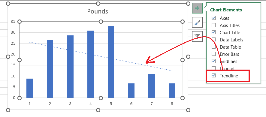
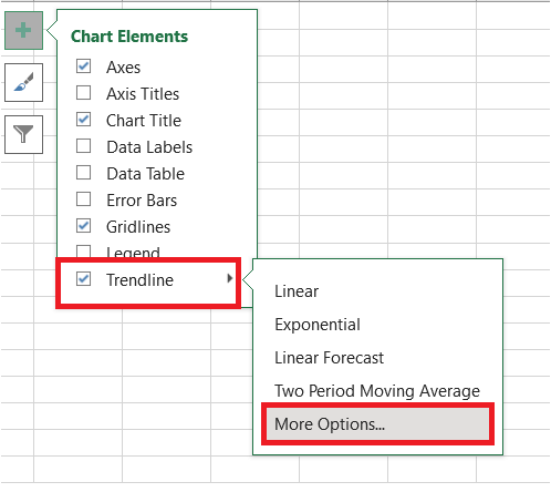
"A trendline, or a line of best fit, is represented either by a straight or curved line in a graph. It displays the generic pattern or complete flow of the chart's data." Trendline is an analytical tool used by Excel users to display data actions over a period of time or the relations between two variables. When a trendline is created, it looks similar to a line chart, but the concept and functionality of both are different. The trendline doesn't connect the data points, whereas line points connect the points, showing the relationship between given data. A best-fit line displays the overall trend in all the data and implicitly ignores the statistical errors and insignificant exceptions. How to add a trendline in ExcelIn the latest versions of Excel, unlike Excel 2013, Excel 2016 and Excel 2019, forming a trend line is quick and super easy. All you need to do is to follow three simple steps:
That it's! 3 steps and your trendline is applied. If you don't want the default trendline and want to customise its look and appearance do the following:
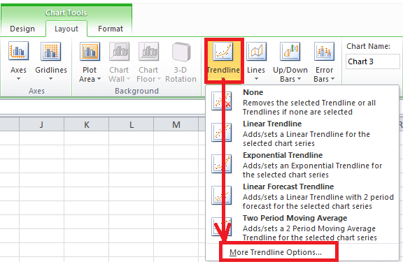
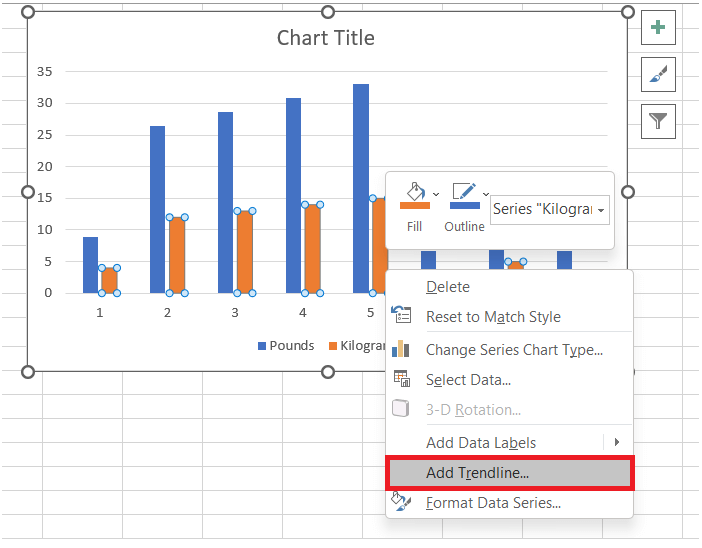
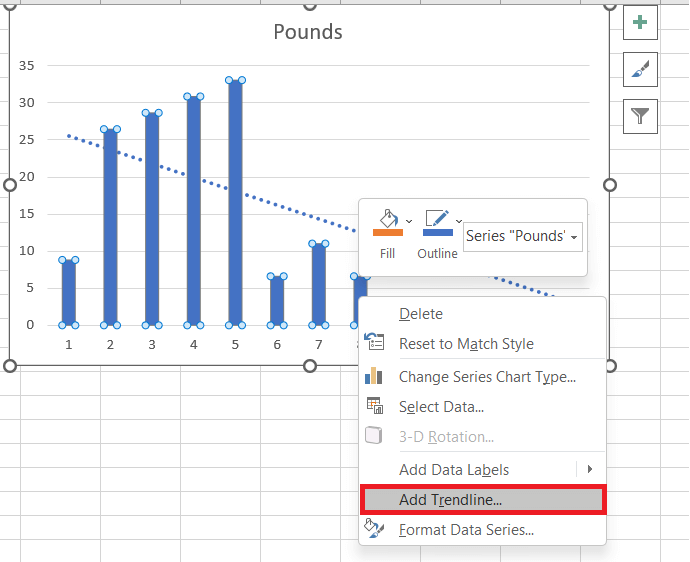
Note: You can also quickly add a trendline to an Excel chart by right-clicking the data series and from the options we will click on Add Trendline?.How create a trendline in Excel 2010In the above section we covered how to add a Trendline to latest Excel versions. But if you are still working on Excel 2010 don't get dishearten, as following the below steps can help you to insert a trendline in Excel 2010. Though the steps are different but the result will be same:
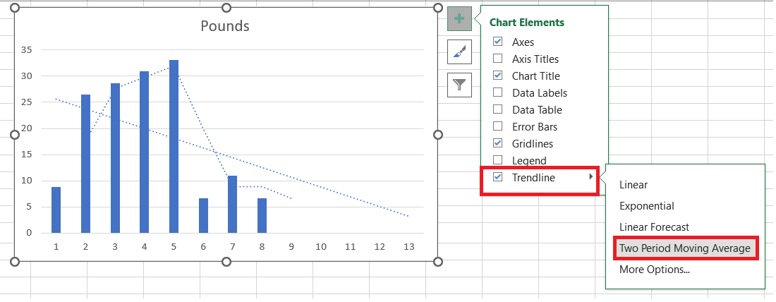
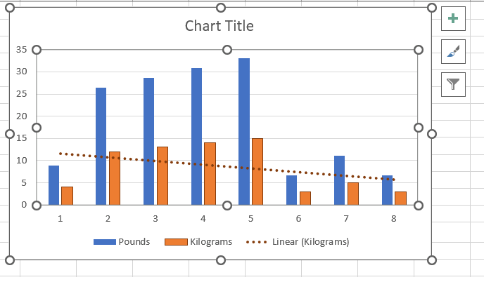
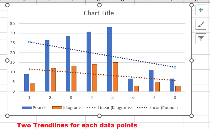
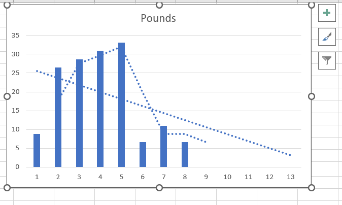
Add multiple Trendline in your worksheetWant to try more with Trendlines. Here you go! Why to get satisfied with one Trendline when Microsoft Excel allows you to add more than one to your chart. We will cover two different methods that should be handled differently. Add a trendline for two or more data series
In the above example, as you can see, we have two data series. To insert two trendlines on a chart separately for two data series, follow the below-given steps:
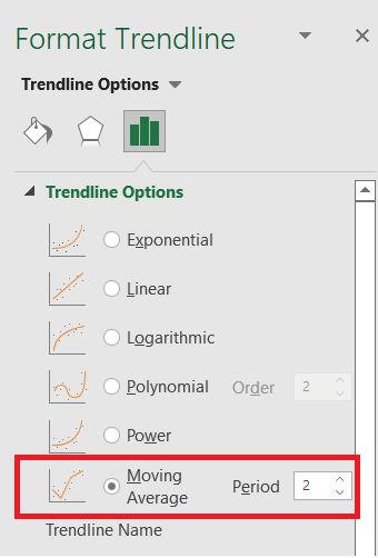
Create different types trendline types for the same data seriesWe can also add two or more different trendlines for the same data series. To implement the same, firstly add the normal trendline by following the above steps, and add the next trendline with the help of the given below steps:
OR
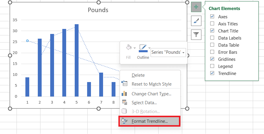
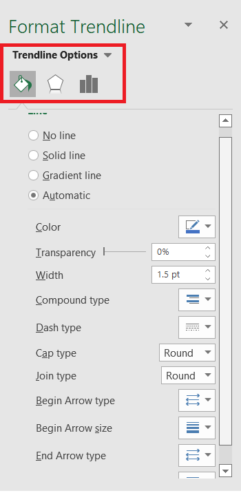
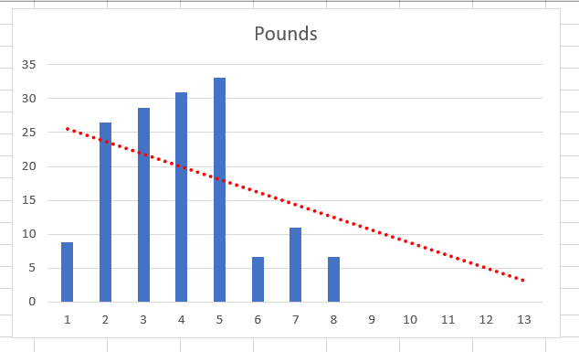
Either way you choose, Excel will show two different trendlines in your chart. How to format a trendline in ExcelWhat if you want your trendline to be more attractive and understandable? Formatting a trendline in an Excel chart is super easy.
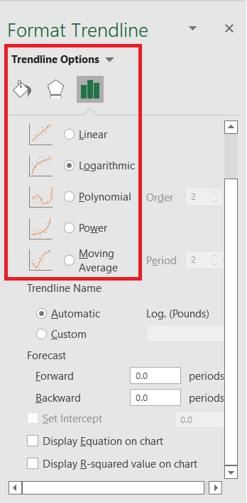
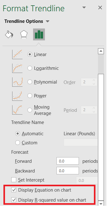
Display the trendline equationSometimes adding the trendline is not enough as you want to show the equation behind the line within the same chart. "Trendline equation is a mathematically formula that is computed to mathematically defines the line that best fits the data points. The resulted equations are different for different trendline types". In this equation, we will compute the R-squared value that describes how well the trendline corresponds to the data?the closer the R2 value to 1, the better the fit. If you want to insert a trendline equation for your chart, do the following:
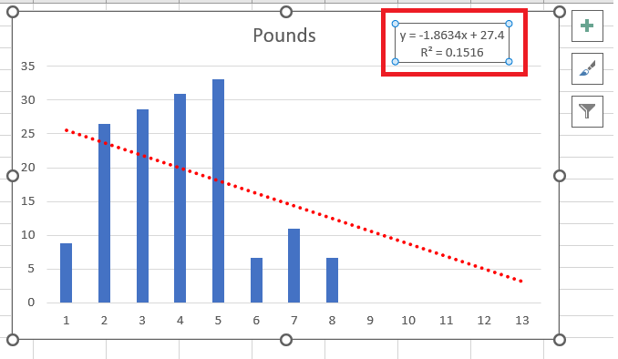
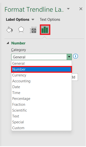
In the above example, the R2 value is coming to be 0.15, indicating that the trendline fits about 15% of our data. Present more digits in the trendline equationSometimes the trendline equation return inaccurate output. It mostly happens if you provide the x values to it manually, most likely it's because of rounding. By default, the numbers supplied in the equation are rounded to 2 - 4 decimal places. However, if you take more digits this problem will be resolved. Below given are steps to add more digits to your trendline equation:
NOTE: The decimal box can take only upto 30 decimal places.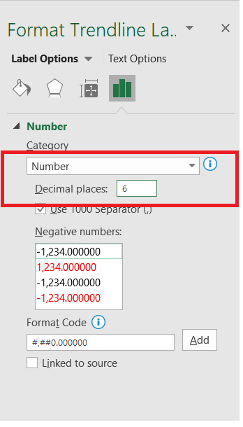
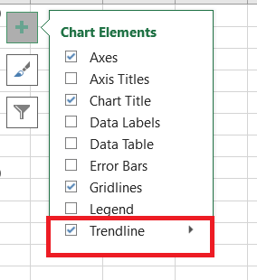
Delete a trendline from ExcelSo far we learnt how to add, format, edit a Trendline. Now what if we want to delete it? To quickly delete a trendline from your chart, follow the below given steps: Right-click on the Trendline, a window dialog box will appear from there click on the Delete option: Or Select the chart, go to the Chart Elements button and unselect the checkbox for Trendline option Both the options will immediately delete the applied trendline from your Excel chart. That's it! We covered everything regarding a trendline in Excel from creating to formatting to creating multiple lines, and finally covering the steps to delete the lines as well if not required. Go ahead and give this Excel feature a try.
Next TopicExcel Sort by Color
|
 For Videos Join Our Youtube Channel: Join Now
Feedback
- Send your Feedback to [email protected]
Help Others, Please Share


