| |

Pie Chart DefinitionPie charts, which typically divide a circle area into parts to represent many categories, are used frequently for the visual representation of data. They are especially helpful when attempting to illustrate how various elements of a whole relate to one another. Pie charts are mostly used in Excel documents to represent data graphically. 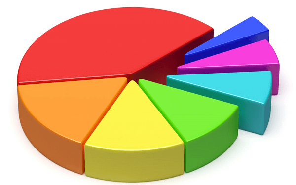
Defining Pie ChartIn order to display numerical data, a pie chart is represented as a circular graph that has been segmented into sectors or slices. The pie's entire surface reflects 100% of the data, with each slice proportionating to the amount of different data it represents. Pie charts are often used to show how different parts of a whole relate to each other. For example, a pie chart might be used to show how a company's revenue is divided among different product lines. Pie charts can also be used to compare different sets of data. For example, a pie chart might be used to show how different age groups in a population are distributed. Pie charts are easy to understand and interpret and can provide a visual representation of complex data in a simple way. Origin of Pie ChartWilliam Playfair, a Scottish engineer, is credited with inventing the pie chart in 1801. He used it to show how the British Empire's trade was divided among different countries. However, it is important to note that Playfair's invention was not the first use of this type of chart. Similar charts had been used by other mathematicians and scientists, such as William Jones in 1715 and Joseph Priestley in 1765. Nevertheless, Playfair's use of the pie chart helped popularize it and became a standard data visualization tool in the following years. Characteristics of a Pie ChartThe following are the notable characteristics of a Pie Chart:
Types of Pie ChartsPie charts are one of the most common visual representation tools used to display data in a way that is easy to understand. They are an excellent way to communicate data in a simple and concise manner, making them ideal for use in a wide range of applications. Fortunately, there are many types of pie charts, such as: 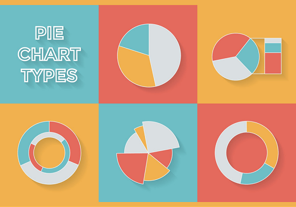
Basic Pie ChartThe basic pie chart is a circular graph arranged into slices or parts, each representing a different category or value. The size of each slice is proportional to the value it represents, with larger slices indicating a higher value. Basic pie charts are useful for displaying data with a small number of categories. Exploded Pie ChartOne or more slices of the pie are separated from the remaining portions in the exploding pie chart, which is a variation of the classic pie chart. The divided slice or slices become more visually prominent as a result, standing out more sharply. Exploded pie charts are helpful for highlighting specific regions or numbers. Doughnut Pie ChartThe standard doughnut pie chart typically consists of a hole in the middle. This results in a data visualization that is more condensed while maintaining the same degree of detail as a simple pie chart. When you wish to present data with a limited number of categories in a condensed and readable way, doughnut pie charts are helpful. Multiple Pie ChartA variant of the basic pie chart in which numerous charts are shown side by side is known as a multiple pie chart. This makes it simple to compare data between several categories or values. When you need to display a lot of categories in a readable and understandable fashion, multiple pie charts might be helpful. Stacked Pie ChartIn the stacked pie chart, which is a variant of the basic pie chart, each slice is divided into smaller slices to represent various values falling under that category. This produces a visual depiction of the various values that make up each category. When you wish to display data with different values inside each category, stacked pie charts are helpful. 3D Pie ChartThe 3D pie chart is a variation of the traditional pie chart that shows the chart in three dimensions. This makes the material more aesthetically appealing but can occasionally make it more challenging to read and comprehend. When you want to present the data in a way that is more visually appealing, 3D pie charts might be helpful. Uses of Pie ChartsPie charts have been known to be a very flexible tool for data visualization. They can be applied in a variety of fields, including science and research, as well as business and finance. Here are some of the most common uses of pie charts: Sales DataPie charts are a common way to show sales statistics. They can be used to display the percentage of sales in every class of product or in various markets or geographic areas. This makes it simple to identify the main sources of sales and potential improvement areas. Demographic DataPie charts can be used to show demographic information, such as the age, gender, or level of education of a specific group. This makes it simple to comprehend a population's demographics and may be helpful for marketing or advertising initiatives that are specifically targeted. Financial DataPie charts can be used to show financial information, such as the breakdown of budgeted expenses or the proportion of revenue derived from various sources. As a result, it is simple to see where money is being spent and where adjustments to generate more revenue can be made. Scientific DataPie charts can be used to show scientific facts, such as the distribution of a specific species or the composition of a specific material. Due to its simplicity, complex data sets can now be easily visualized, which is helpful for research and scientific publications. Marketing DataPie charts can be used to show marketing information, such as the breakdown of website traffic by source or the proportion of buyers that favor a specific product. This makes it simple to comprehend the efficacy of various marketing techniques and can be helpful when deciding on future marketing initiatives. Survey DataData from surveys, such as the proportion of respondents who provided a certain response to a question in a particular fashion, can be displayed using pie charts. This makes it simple to comprehend the survey data's broad trends and may be helpful when making decisions based on the findings. Project Management DataPie charts can be used to illustrate information about project management, such as the division of work into categories or the proportion of tasks that have been completed at each stage of a project. This facilitates project progress understanding and may be helpful in deciding how to allocate resources and set timetables. Attributes and Effectiveness of a Pie Chart
Limitation of a Pie Chart
Differences between a Pie Chart and a Bar GraphTwo of the most popular ways to present data visually include using pie charts and bar graphs. They are suitable for many types of data and various methods of analysis despite having many commonalities and important distinctions. Considering various factors into account, let us discuss some of the notable differences between these two chart types: 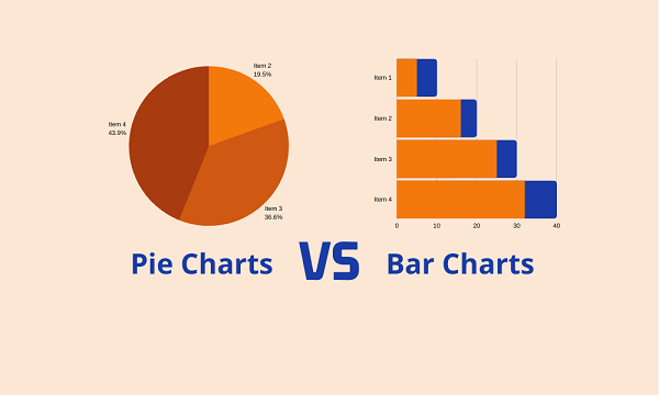
ConclusionIn conclusion, pie charts are a simple and effective way to present visually appealing data. Their attributes, including their simplicity, easy-to-understand design, and ability to show proportions, make them an effective tool for data visualization. Their effectiveness in presenting data clearly, comparing different categories, showing trends, focusing on important categories, and their visually appealing structure make them a valuable tool for presenting data in a clear and engaging way.
Next TopicPlant Cell Definition
|
 For Videos Join Our Youtube Channel: Join Now
Feedback
- Send your Feedback to [email protected]
Help Others, Please Share


